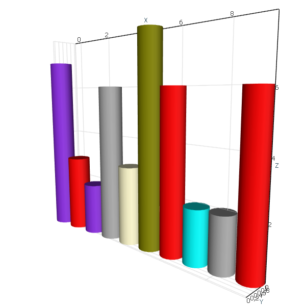
 Bar Graph Bar Graph |
 Area Graph Area Graph |
 Bubble Chart Bubble Chart |
 Funnel Chart Funnel Chart |
 Scatter Plot Chart Scatter Plot Chart |
 Stacked Bar Graph Stacked Bar Graph |
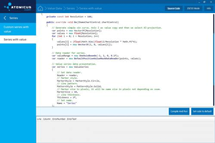
AtomicusChart® has no integrated render data types to draw simple items such as bars, bubbles, scattering, and so on. However, this can be done easily with just a few lines of code using our flexible API.
To do so, we create a mesh that will describe our single item, prepare a method that converts the single value into our mesh transformation, and then put it into a collection. This is an extremely fast and flexible solution. You can easily replace the mesh at runtime and change colors and values with minimal delay and memory allocations.
Bar Graph
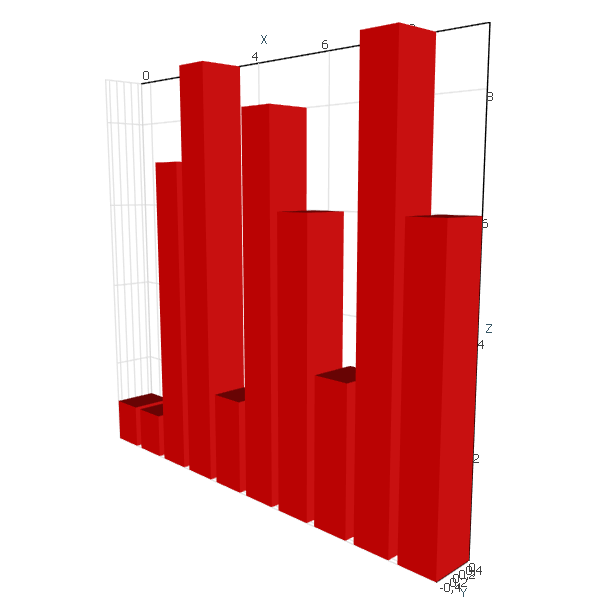
Bar graphs are used to compare various items. One of the axes of a bar graph features the categorical variables being compared, while the other axis signifies the value of each.
The first step is to define our mesh object:
//Define mesh
var barMesh = CubeMeshFactory.GenerateCube();
Next, we define how the bar value is transformed into a transformation matrix:
//Configure transform
Matrix4F Transform(float x, float value)
{
	return
		Matrix4F.Scaling(0.8f, 1, 1)
		* Matrix4F.Translation(x, 0, 0.5f)
		* Matrix4F.Scaling(1, 1, value);
}
Finally, we put it all into a collection and display:
//Generate some random data
var random = new Random();
var values = Enumerable.Range(0, 10).Select(x => new { X = x, Value = random.Next(10) });

//Add all into data collection
var bars = new SingleColorPrimitiveCollection(values.Select(v => Transform(v.X, v.Value)).ToArray())
{
	Mesh = barMesh
};
ChartControl.DataSource = bars;
We can easily add colors to highlight important data points:
//Define mesh
var barMesh = CylinderMeshFactory.CreateCylinder(20);

var myColors = new[] { Colors.Red, Colors.Aqua, Colors.DarkGray, Colors.Olive, Colors.BlueViolet, Colors.LemonChiffon };
//Configure transform
Matrix4F Transform(float x, float value)
{
	return
		Matrix4F.Scaling(0.9f, 0.9f, 1)
		* Matrix4F.Translation(x % 10, x / 10, 0.5f)
		* Matrix4F.Scaling(1, 1, value);
}
//Generate some random data
var random = new Random();
var values = Enumerable.Range(0, 10).Select(x => new { X = x, Value = random.Next(10) });
var colors = Enumerable.Range(0, 10).Select(x => myColors[random.Next(myColors.Length)]).ToArray();

//Add all into data collection
var bars = new MultiColorPrimitiveCollection
{
	Mesh = barMesh
};
bars.SetTransformsAndColor(values.Select(v => Transform(v.X, v.Value)).ToArray(), colors);
ChartControl.DataSource = bars;
And the result:
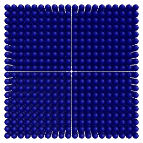
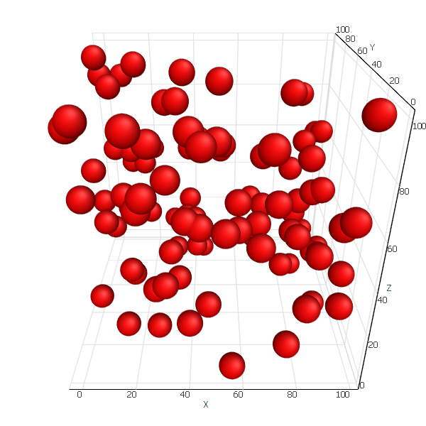
Bubble Chart
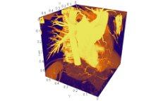
Bubble charts are used to compare the relations between values in 3D. Along with x and y values, a third value is represented through the size of the bubbles.
//Define mesh
var bubble = SphereMeshFactory.GetSphere(5);
//Configure transform
Matrix4F Transform(Vector3F position)
{
	return
		Matrix4F.Scaling(10)
		* Matrix4F.Translation(position);
}
//Generate some random data
var random = new Random();
var values = Enumerable.Range(0, 100)
	.Select(x => new Vector3F(random.Next(100), random.Next(100), random.Next(100)));

//Add all into data collection
var bars = new SingleColorPrimitiveCollection(values.Select(Transform).ToArray())
{
	Mesh = bubble
};
ChartControl.DataSource = bars;
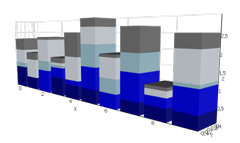
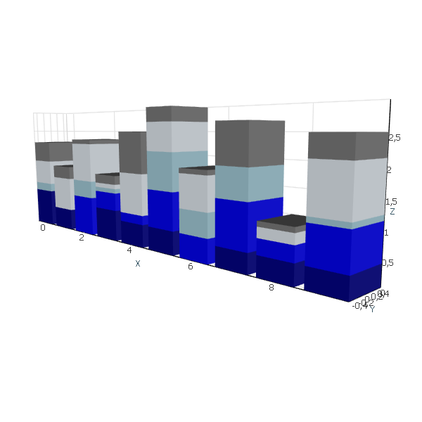
Stacked Bar Graph
This type of graph is used to compare several variables at once and to show their relation to the total value. Each segment in the bar features the categories of that value, which are differentiated through different colors.
//Define mesh
var barMesh = CubeMeshFactory.GenerateCube();
var colorSet = new[] { Colors.DarkBlue, Colors.Blue, Colors.LightBlue, Colors.AliceBlue, Colors.Gray };

//Generate some random data
var transforms = new List<Matrix4F>();
var colors = new List<Color4>();
var random = new Random();
for (int x = 0; x < 10; x++)
{
	float total = 0;
	for (int y = 0; y < colorSet.Length; y++)
	{
		var value = random.Next(10) /10f;
		transforms.Add(Matrix4F.Scaling(0.8f, 1, 1) //Reduce bar to get bit space between bars
						* Matrix4F.Translation(x, 0, 0.5f) //Move it base to 0
						* Matrix4F.Scaling(1, 1, value)//Scale according to value
						* Matrix4F.Translation(0, 0, total));//Move it up
		colors.Add(colorSet[y]);
		total += value;
	}
}
//Add all into data collection
var bars = new MultiColorPrimitiveCollection
{
	Mesh = barMesh,
	PresentationType = PrimitivePresentationType.Solid
};
bars.SetTransformsAndColor(transforms.ToArray(), colors.ToArray());

ChartControl.DataSource = bars;
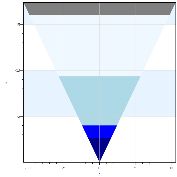
Funnel Chart
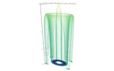
Funnel charts show how values change through multiple stages in a process.
//Define mesh
var tetrahedron = TetrahedronMeshFactory.CreateTetrahedron();

var colorSet = new[] { Colors.DarkBlue, Colors.Blue, Colors.LightBlue, Colors.AliceBlue, Colors.Gray };
//Generate some random data
var transforms = new List<Matrix4F>();
var colors = new List<Color4>();
var random = new Random();
int total = 0;

for (int y = 0; y < colorSet.Length; y++)
{
	var value = random.Next(10);
	total += value;

	transforms.Add(Matrix4F.Translation(0, 0, -1)
		* Matrix4F.Scaling(total, total, total) //
		* Matrix4F.Translation(0, 0, -y * 0.01f)//Small trick to reduce Z-fighting issues
		);
	colors.Add(colorSet[y]);

}

//Add all into data collection
var bars = new MultiColorPrimitiveCollection()
{
	Mesh = tetrahedron
};
bars.SetTransformsAndColor(transforms.ToArray(), colors.ToArray());

ChartControl.DataSource = bars;
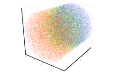
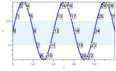
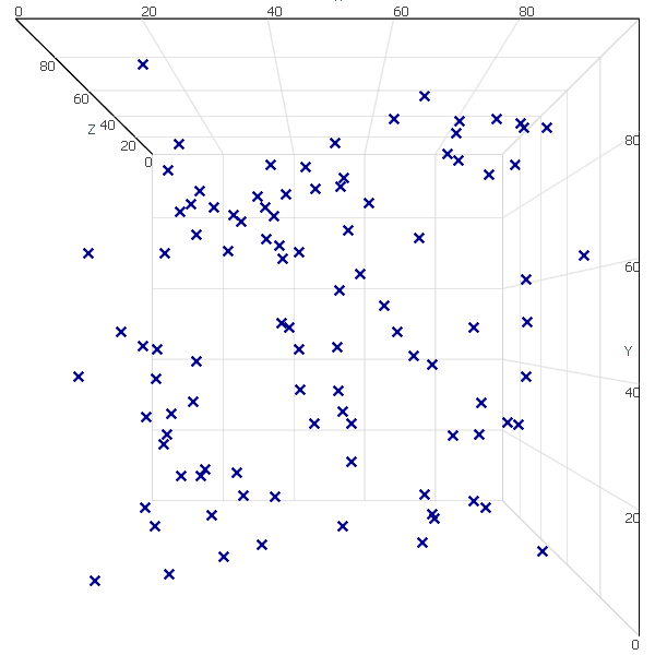
Scatter Plot Chart
Scatter plots are used to illustrate the relationship between two or more variables or distribution tendencies. The chart shows data points at the intersection of the x and y axes, indicating the correlation between them.
//Generate some random data
var random = new Random();
var values = Enumerable.Range(0, 100)
	.Select(x => new Vector3F(random.Next(100), random.Next(100), random.Next(100)));


var reader = new DefaultPositionMaskDataReader(values.ToArray());
var scatter = new Series()
{
	Reader = reader,
	MarkerColor = Colors.DarkBlue,
	MarkerSize = 10,
	MarkerStyle = MarkerStyle.Cross,
	Thickness = 0
};

ChartControl.DataSource = scatter;
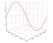
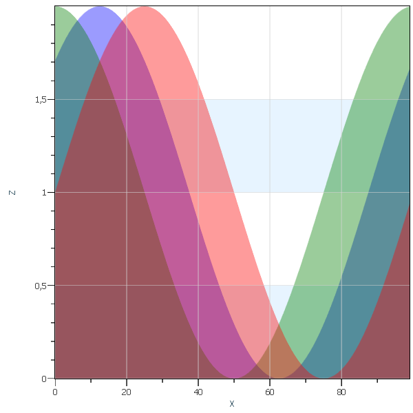
Area Graph
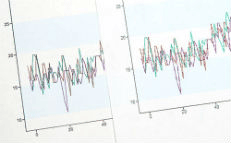
An area graph is a line graph with the space between values and lines filled with a certain color. Like line graphs, area graphs are used to visualize quantitative variables over a period of time.
Let’s define some helper classes:
private class Area : SingleColorPrimitive
{
	private readonly Mesh mesh;

	public Area(Vector3F[] sampleData)
	{
		var fillData = new Vector3F[sampleData.Length * 2];
		int index = 0;
		for (int i = 0; i < sampleData.Length; i++)
		{
			var p = sampleData[i];
			fillData[index++] = p;
			p.Z = 0;
			fillData[index++] = p;
		}
		mesh = new Mesh(fillData, new Vector3F[fillData.Length], GridHelper.GetStructuredTriangleListIndices(0, 2, sampleData.Length, 1), new int[fillData.Length]);
	}

	public override void GetGeometryTransforms(out Matrix4F geometryTransform)
	{
		geometryTransform = Matrix4F.Identity;
	}

	public override Mesh GetMesh() => mesh;
}
Now it can be implemented easily:
const int count = 100;
//Generation of sample data.
var sampleDataR = Enumerable.Range(0, count)
	.Select(x => new Vector3F(x, 0, (float)Math.Sin(x * Math.PI * 2 / count) + 1f))
	.ToArray();

var sampleDataG = Enumerable.Range(0, count)
	.Select(x => new Vector3F(x, 1, (float)Math.Sin(Math.PI / 2 + x * Math.PI * 2 / count) + 1f))
	.ToArray();

var sampleDataB = Enumerable.Range(0, count)
	.Select(x => new Vector3F(x, 2, (float)Math.Sin(Math.PI / 4 + x * Math.PI * 2 / count) + 1f))
	.ToArray();

// Setup chart control view settings.
ChartControl.View.Camera2D.Projection = Projection2DTypes.XPosZPos;
ChartControl.View.Mode2D = true;

ChartControl.DataSource = new RenderData[] {
	new Area(sampleDataR) { Color = new Color4(Colors.Red, 100) },
	new Area(sampleDataG) { Color = new Color4(Colors.Green, 100) },
	new Area(sampleDataB) { Color = new Color4(Colors.Blue, 100) }
};
In this article, we have given only a brief description of how new type of data can be easily rendered with the help of flexible API of AtomicusChart®.